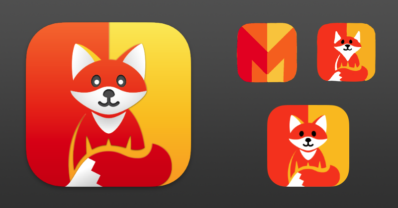
We love working with independent developers so when Yan chose us to design a new icon for Marta, his fast and efficient file management app, we were delighted. The client decided on a strong base metaphor illustrating two columns that mirrored the app’s user interface, so we started with a round of sketches (using Linea of course) playing off of a stylized letter M.
As the concept progressed it became clear Marta needed a mascot so based on a quick sketch from the developer this adorable fox emerged. Like Marta, foxes are quick and smart. We kept the feel of the original concept and integrated the character into the final split color design.